
Neota is a no-code automation platform — used by law firms, enterprises, and governments around the world to build sophisticated automation tools without traditional software development.
After over a decade in the market, Neota’s visual identity was starting to show its age. The brand had recognition, but it lacked clarity. A visual refresh was the immediate priority — and I was asked to lead it.
I’d originally recommended we start by revisiting the messaging to shape the design direction, but timing didn’t allow for that right away. So I focused on delivering a visual identity that could meet the moment and carry the company forward.
About a year later, when the need for clearer messaging became undeniable, I led that initiative too — ensuring the voice and visuals finally matched.


When I was asked to lead the visual refresh for Neota, I began by taking a close look at where we were starting from. The previous identity, built around the name "Neota Logic," featured an intricate, science-like logo and a muted palette of greyish blues. While thoughtful in concept, it no longer captured who we were becoming — a modern platform used by professional services teams across industries.
I collaborated with leadership and marketing to develop a new visual identity that reflected our growth, credibility, and innovation. Though we weren’t ready to revisit messaging yet, I created a bold, modern, and professional look to help Neota stand out in a competitive space.
And yes, we finally dropped the “Logic” from the name in our outward-facing materials — something we’d already done internally for years.


I led the design of our new marketing website — from structuring the content and designing page flows, to building out a flexible design system and defining the look and feel. Along the way, I created the illustrations, product animations, imagery, and microinteractions that bring the brand to life online. It was a true team effort, but I had the opportunity to shape almost every visual and interactive detail you see.
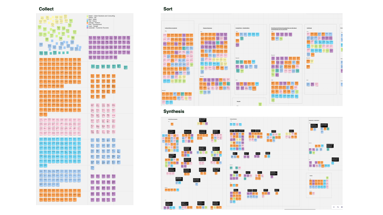
To ground our work in insight, I started by gathering a complete picture of the landscape:
The discovery work surfaced themes, tensions, and blind spots. It also helped us identify what made Neota distinct — and what messaging would resonate with our audiences.
From the insights gathered, I developed three key personas:
These personas weren’t abstract — they became a living tool for making brand and product decisions with real empathy.
Defining the company’s north star wasn’t a quick process. Early alignment proved tricky, and while I facilitated initial discussions, it wasn’t until a new CMO joined that momentum picked up. With their support, we reached agreement on our mission and vision, providing a much-needed foundation for all future messaging.
With a clear understanding of our audiences, I worked to define a mission and vision that felt authentic and aligned across the business. I facilitated alignment sessions, iterated with leadership, and helped land language that gave the brand—and team—a shared sense of direction.
With those foundations in place, I led the creation of a digital messaging guide to bring it all together. I wrote the personas and contributed to tone, values, and positioning, collaborating closely with teammates to make the guide practical, cohesive, and usable across teams.


With the building blocks in place, I led the creation of a digital messaging guide — a shared resource to keep everyone (from product to sales to marketing) speaking the same language. I wrote the personas and contributed to sections on tone, values, and positioning, while collaborating closely with other team members to make sure it all felt cohesive and usable.

The new visual and messaging systems gave Neota the clarity to move forward with confidence — more aligned internally, more engaging externally, and more consistent across every touchpoint. While the work was deeply collaborative, I’m proud to have contributed meaningfully to how Neota shows up in the world.
The feedback — from transforming internal perception to being mistaken for agency work — was a reminder of what intentional design can do. More than anything, it reinforced my appreciation for the clarity, empathy, and momentum strong brand work can bring.


