When you’re designing the navigation hub of a complex platform, every pixel really does matter. That was the case with the Explorer—the side panel at the heart of Neota’s new web-based app builder, Architect.
Explorer had already made the leap from our legacy platform, Studio, thanks to a solid structural redesign by another designer. I came in during that transition to rework the icon system and visual cues — swapping cryptic dots and diamonds for something more intuitive and cohesive.
Once users got hands-on, a few more opportunities to improve surfaced (as they always do). I jumped back in to refine the hierarchy, clarify interactions, and smooth out the experience. The Explorer didn’t need a reinvention — just a thoughtful tune-up to better support how people really work.
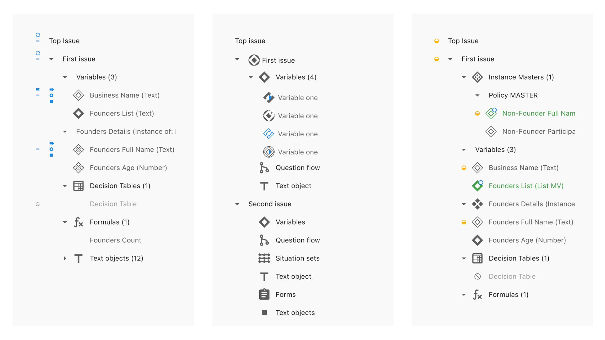
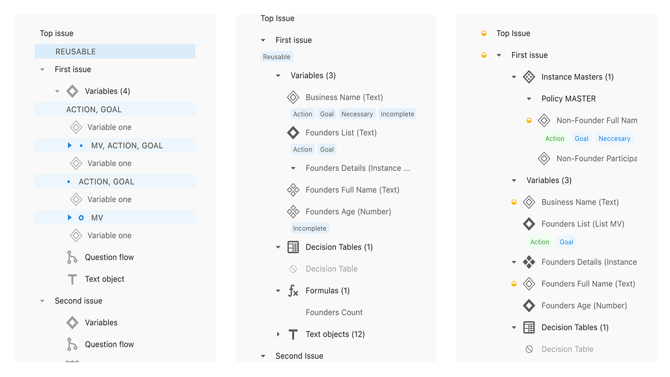
One of the trickier challenges was how to show whether a variable had certain qualities — like actions, goals, or notes — directly from the Explorer. Previously in Studio, this was done with yellow dots, green diamonds, and arrows and letters on hexagons.
One of the trickier challenges was how to show whether a variable had certain qualities — like actions, goals, or notes — directly from the Explorer. Previously in Studio, this was done with yellow dots, green diamonds, and arrows and letters on hexagons.


I led the design of our new marketing website — from structuring the content and designing page flows, to building out a flexible design system and defining the look and feel. Along the way, I created the illustrations, product animations, imagery, and microinteractions that bring the brand to life online. It was a true team effort, but I had the opportunity to shape almost every visual and interactive detail you see.
We didn’t need literal illustrations, but we did need icons that hinted at purpose, grouped logically, and felt cohesive. The result was a more legible, consistent visual language that gave Explorer its own identity within Architect.
We explored two design directions, for the rework of surfacing statuses in the Explorer:
While Option A had nostalgia on its side, Option B came out on top with both newcomers and seasoned users.
Text labels made variables and tools more immediately understandable — especially in team environments where handovers are common.
With a clear understanding of our audiences, I worked to define a mission and vision that felt authentic and aligned across the business. I facilitated alignment sessions, iterated with leadership, and helped land language that gave the brand—and team—a shared sense of direction.
With those foundations in place, I led the creation of a digital messaging guide to bring it all together. I wrote the personas and contributed to tone, values, and positioning, collaborating closely with teammates to make the guide practical, cohesive, and usable across teams.


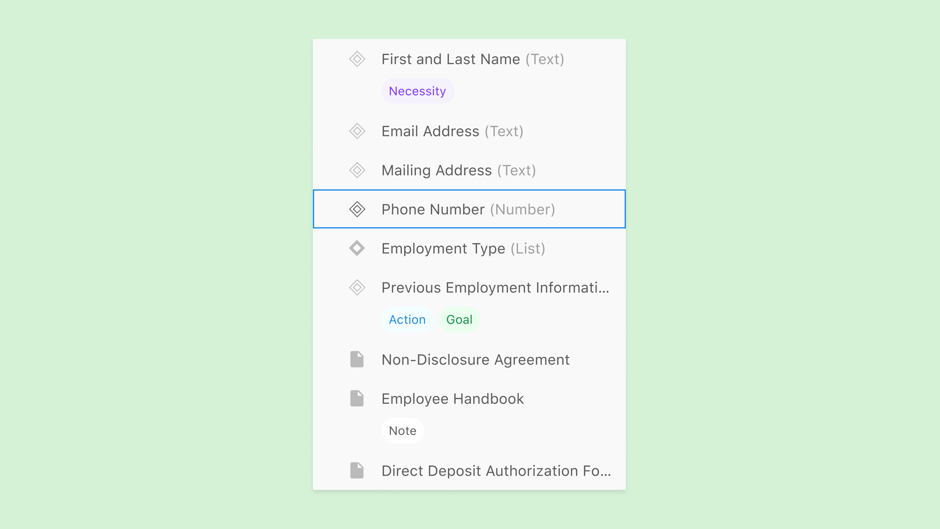
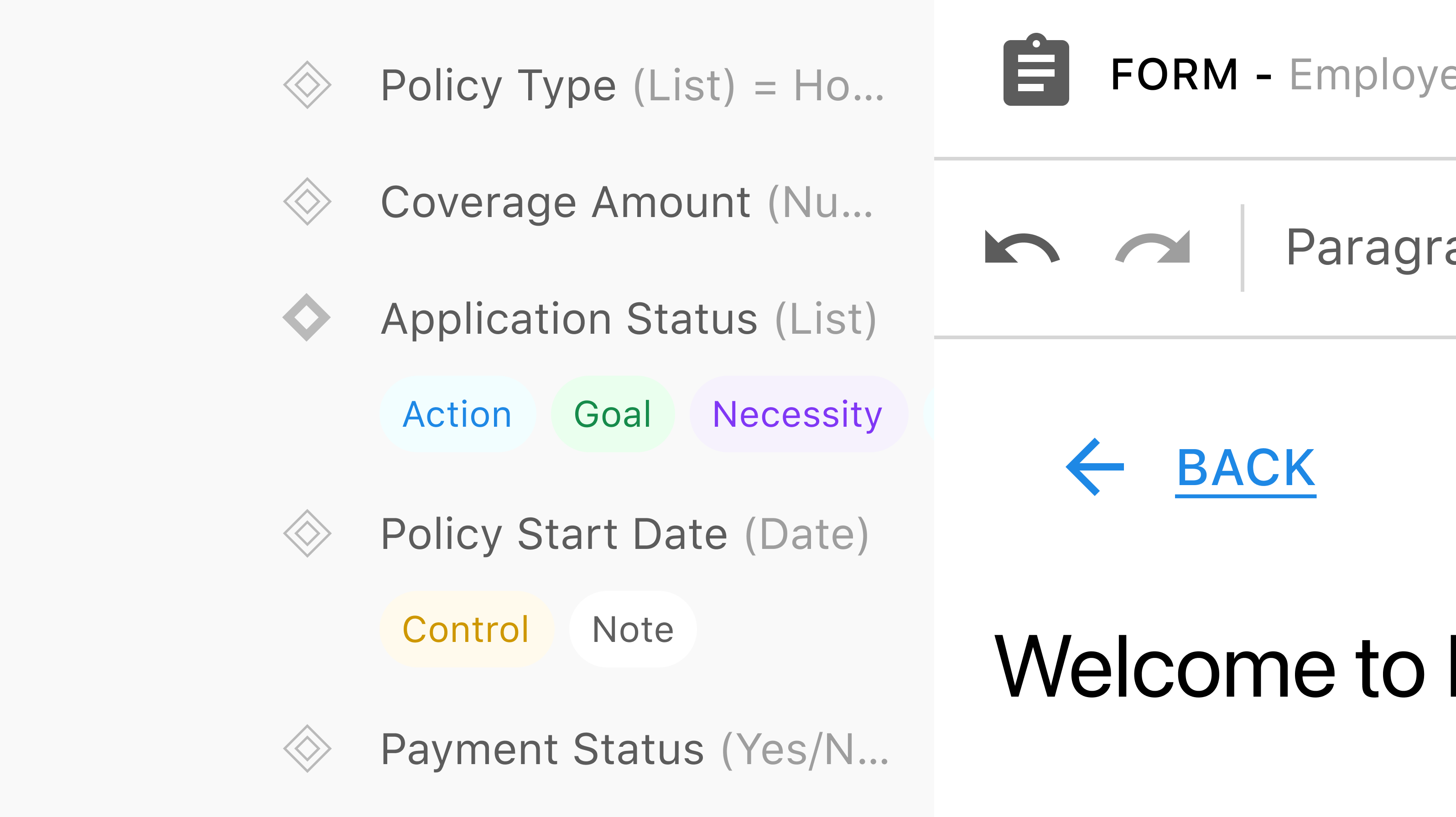
For variable icons, we simplified the shape to a diamond and made it clearer: empty for questions, filled for conclusions.
Then added labeled pills like “action”, “goal” or “note” to convey different statuses.
No guessing, no codebreaking — just clean, readable context.
Through testing, we learned that most people preferred selecting an issue first, then clicking to add a tool — so we introduced an “Add” button directly in the Explorer.
We kept the existing drag-and-drop option for flexibility, but made it easier to get things right the first time.
We noticed a problem: warnings were popping up everywhere. They were just trying to help — but the volume was too much, too soon.
I suggested a different approach: what if warnings weren’t always in your face, but something you could choose to engage with when you were ready?
So we added a toggle. You’ll see a count in the header, click it when you want to debug, and get a focused panel that opens on the right-hand side.
Tying it back to the Explorer, I also mapped out how warnings would show up inside the navigation panel itself — giving authors a way to visually locate and jump to flagged items underneath nested layers.

Early internal testing has been encouraging. Feedback from beta testers — especially those familiar with Studio — highlights; fewer usability hurdles, smoother onboarding for new users and reduced friction when switching between and adding tools.


