As part of Neota’s transition to a web-based platform, I redesigned the formula editor — affectionately known as the “Swiss Army knife” of Neota’s logic tools. The goal?
Make something powerful feel simple.
By streamlining the experience and rethinking how users create, edit, and understand formulas, we improved usability for everyone — from beginners to power users.
The legacy formula editor in Neota’s desktop app (Studio) was undeniably powerful — but also undeniably confusing. To even open the editor, users first had to create a formula, name it, select a result type, and choose a function — all before they could begin writing any logic. This front-loaded complexity made an already intricate task feel even more overwhelming.
The legacy formula editor in Neota’s desktop app (Studio) was undeniably powerful — but also undeniably confusing. To even open the editor, users first had to create a formula, name it, select a result type, and choose a function — all before they could begin writing any logic. This front-loaded complexity made an already intricate task feel even more overwhelming.


I led the design of our new marketing website — from structuring the content and designing page flows, to building out a flexible design system and defining the look and feel. Along the way, I created the illustrations, product animations, imagery, and microinteractions that bring the brand to life online. It was a true team effort, but I had the opportunity to shape almost every visual and interactive detail you see.
Rather than just redesign the UI, we reframed the entire experience around one core principle: progressive disclosure. Instead of overwhelming users with every possible function and input up front, we guided them step-by-step—surfacing only what was relevant at each point in time.
I ran a competitive audit of 20+formula editors, understanding best practices. These helped to inform decisions on layout, and interaction patterns.
I built multiple Figma prototypes to explore layout directions — from vertically stacked prefixes to horizontally compact views. We tested these with a broad internal audience, from technical specialists to newer users seeing the editor for the first time.
These insights heavily shaped both the visual and behavioural patterns of the final design.
With a clear understanding of our audiences, I worked to define a mission and vision that felt authentic and aligned across the business. I facilitated alignment sessions, iterated with leadership, and helped land language that gave the brand—and team—a shared sense of direction.
With those foundations in place, I led the creation of a digital messaging guide to bring it all together. I wrote the personas and contributed to tone, values, and positioning, collaborating closely with teammates to make the guide practical, cohesive, and usable across teams.


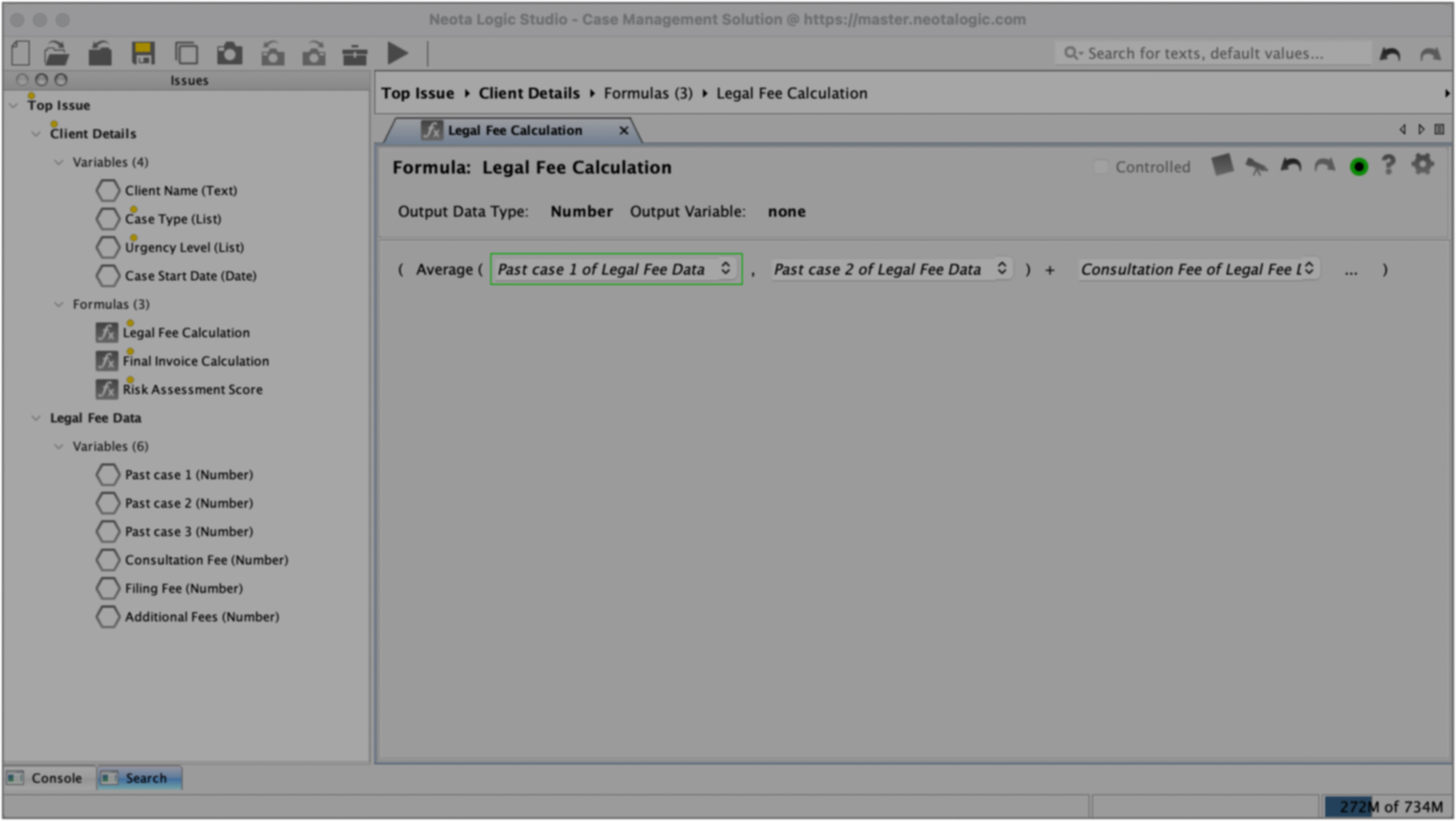
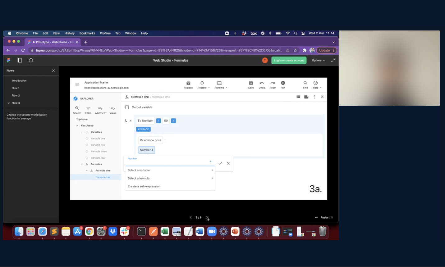
We kept the core structure familiar where users start by selecting the result type. But instead of first choosing a function from a broad group (as in the old editor), users are now taken straight into the formula editor.
From there, the function panel dynamically filters to show only functions relevant to the selected output type — removing guesswork and helping users stay focused on their task. It’s a subtle shift, but one that makes the process feel more intuitive and less front-loaded with decisions.
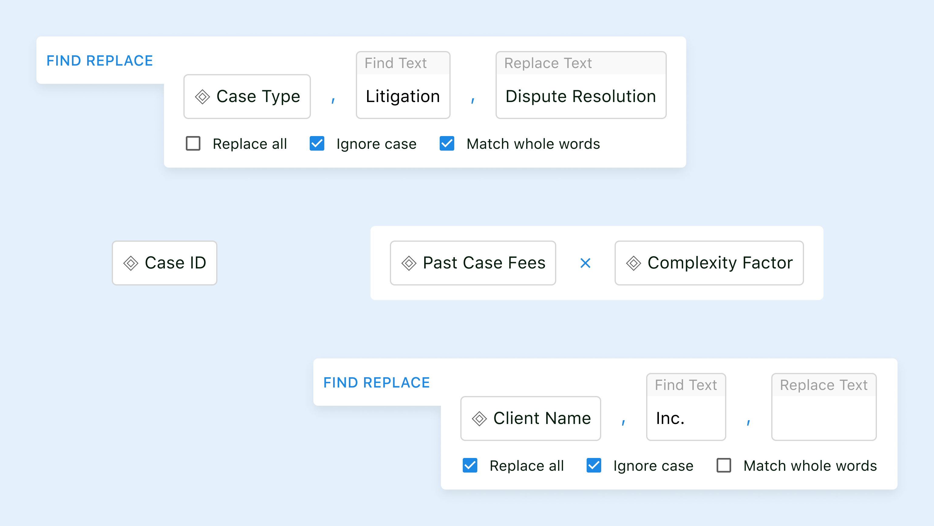
To support both visual and text-based thinkers, we added a live summary line showing the entire formula in traditional syntax. Clicking on any part of the formula lets users jump directly to that input for editing.
Each input field now includes two lines: one describing the data type (e.g. text, number, URL) and another providing a plain-English prompt about its purpose — helping reduce cognitive load.
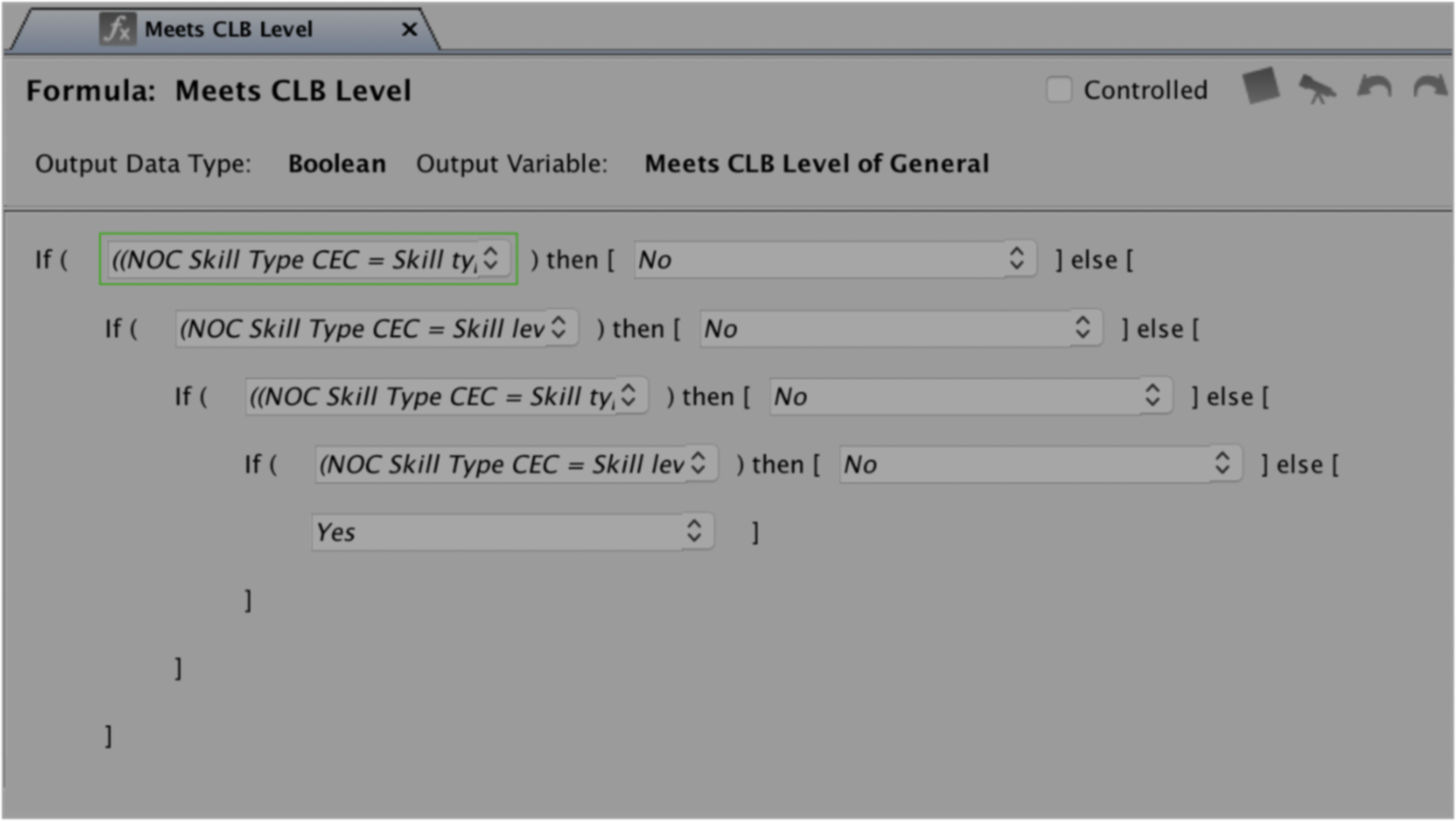
Previously, adding optional inputs — like extra values in an average function — just wasn’t possible. And inserting new functions mid-formula? Tedious at best. Now, users can simply click where they want to add something, and a cursor appears — making it easy to slot in additional inputs or functions on the fly.

This project reinforced a lesson I keep coming back to: clarity is a power feature. Instead of hiding complexity, we made sure it appeared only when users needed it. Balancing power and simplicity — when it’s done well, it lifts the experience for everyone.


