Des(i)gna

Project type
Publication Design
Client
Self-initiated (University project)
My role
Designer
Where Design Meets the Shifting Landscape of Feminism

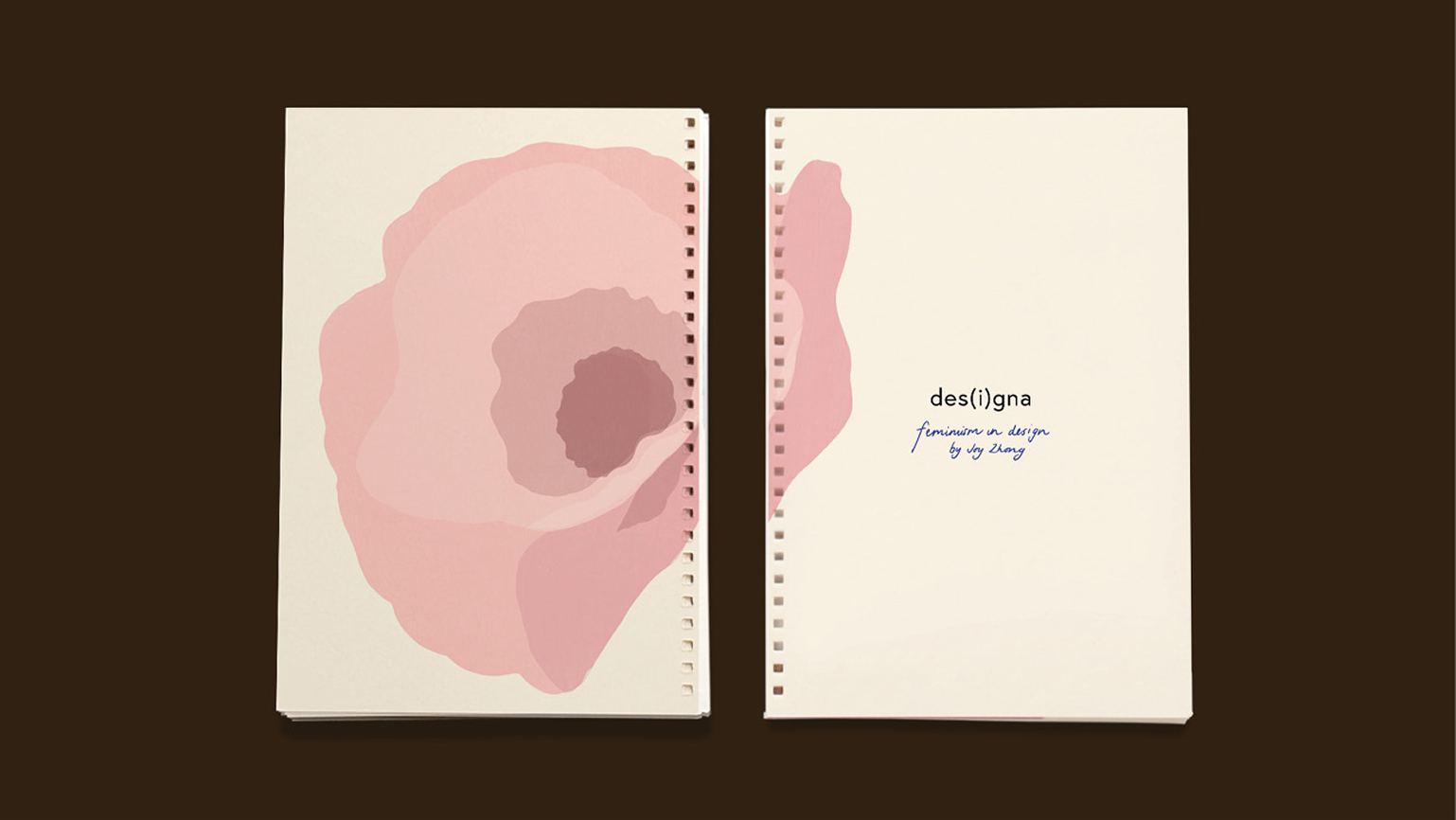
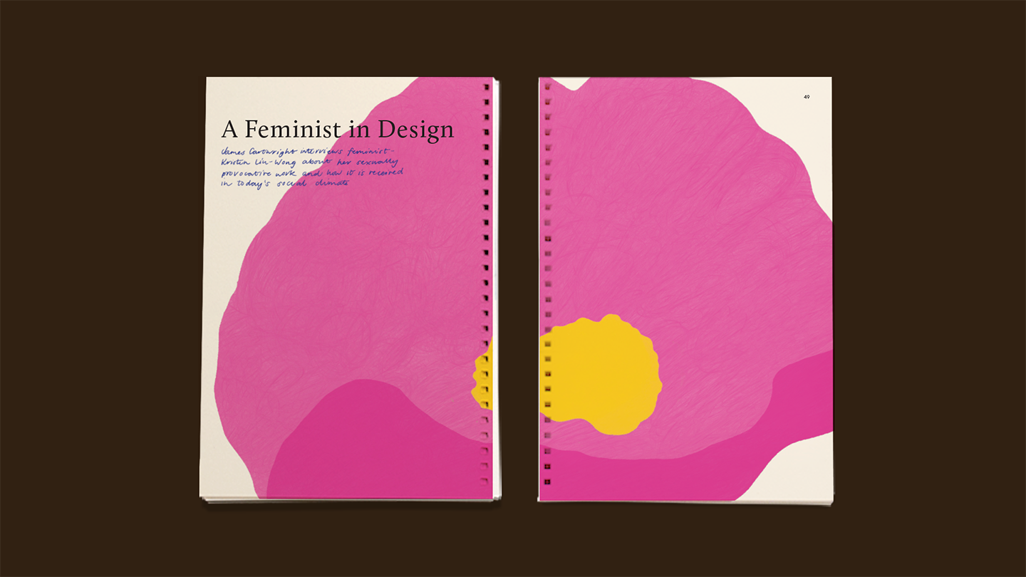
Des(i)gna is a self-initiated, three-part publication, I created during university, that’s part research, part visual exploration, and part personal expression. Each chapter tackles a different facet of the relationship between feminism and design:

  1. Why design needs feminism – the role design plays in shaping culture.
  2. Why feminism needs design – showcasing graphic works that have challenged the status quo. These card-style inserts leave an impression (literally and typographically) on the surrounding text, symbolising how design leaves its mark on movements.
  3. A conversation with a feminist illustrator – an interview brought to life with handwritten responses, making it feel more like a journal.

All illustrations and design are original, with content curated from talented writers and thinkers in the field. The publication is bound with silver rings for a raw, tactile finish.

Blue Neota pull-up banner with the message 'Powerful, Flexible'
Green Neota pull-up banner with the message 'Maximise Value'
Outdoor banner mockup featuring an illustration of a woman floating on the Neota logo like a lifesaver, with the headline 'Automation that keeps you afloat'
Mockup of 'The Gap' section from chapter 1 of the des(i)gna book
Introductory page of chapter 2 titled '21st Century' in the des(i)gna book mockup
Mockup of chapter 2 'Sexed Realities' in the des(i)gna book with the front of the inserted art card visible
Mockup of des(i)gna book chapter 2 'Sexed Realities' showing the insert art card flipped to reveal its back
Mockup of chapter 3 titled 'A Feminist in Design' from the des(i)gna book
Mockup of spread two from chapter 3 of the des(i)gna book
Mockup of spread six from chapter 3 of the des(i)gna book
Mockup of spread seven from chapter 3 of the des(i)gna book

Website

I led the design of our new marketing website — from structuring the content and designing page flows, to building out a flexible design system and defining the look and feel. Along the way, I created the illustrations, product animations, imagery, and microinteractions that bring the brand to life online. It was a true team effort, but I had the opportunity to shape almost every visual and interactive detail you see.

Messaging Guidelines

With a clear understanding of our audiences, I worked to define a mission and vision that felt authentic and aligned across the business. I facilitated alignment sessions, iterated with leadership, and helped land language that gave the brand—and team—a shared sense of direction.

With those foundations in place, I led the creation of a digital messaging guide to bring it all together. I wrote the personas and contributed to tone, values, and positioning, collaborating closely with teammates to make the guide practical, cohesive, and usable across teams.

Mockup of an open Neota brandbook showing the introduction page with the phrase ‘More than just a technology company'
Mockup of an open Neota brandbook displaying the company values page
Mockup of an open Neota brandbook displaying the voice versus tone page
Triple Venn diagram illustrating the intersection of processes, logic, and documents forming Neota, over a layered dot pattern background

This project was not only a deep dive into a topic I care about, but also a chance to explore how editorial design can carry meaning beyond aesthetics.

Other projects